

Product cards appear in collections, the featured collection section, search results, product recommendations and the cart drawer's recommendations. They all read the same five settings under Theme settings → Product cards, so every card in the store matches.
The settings
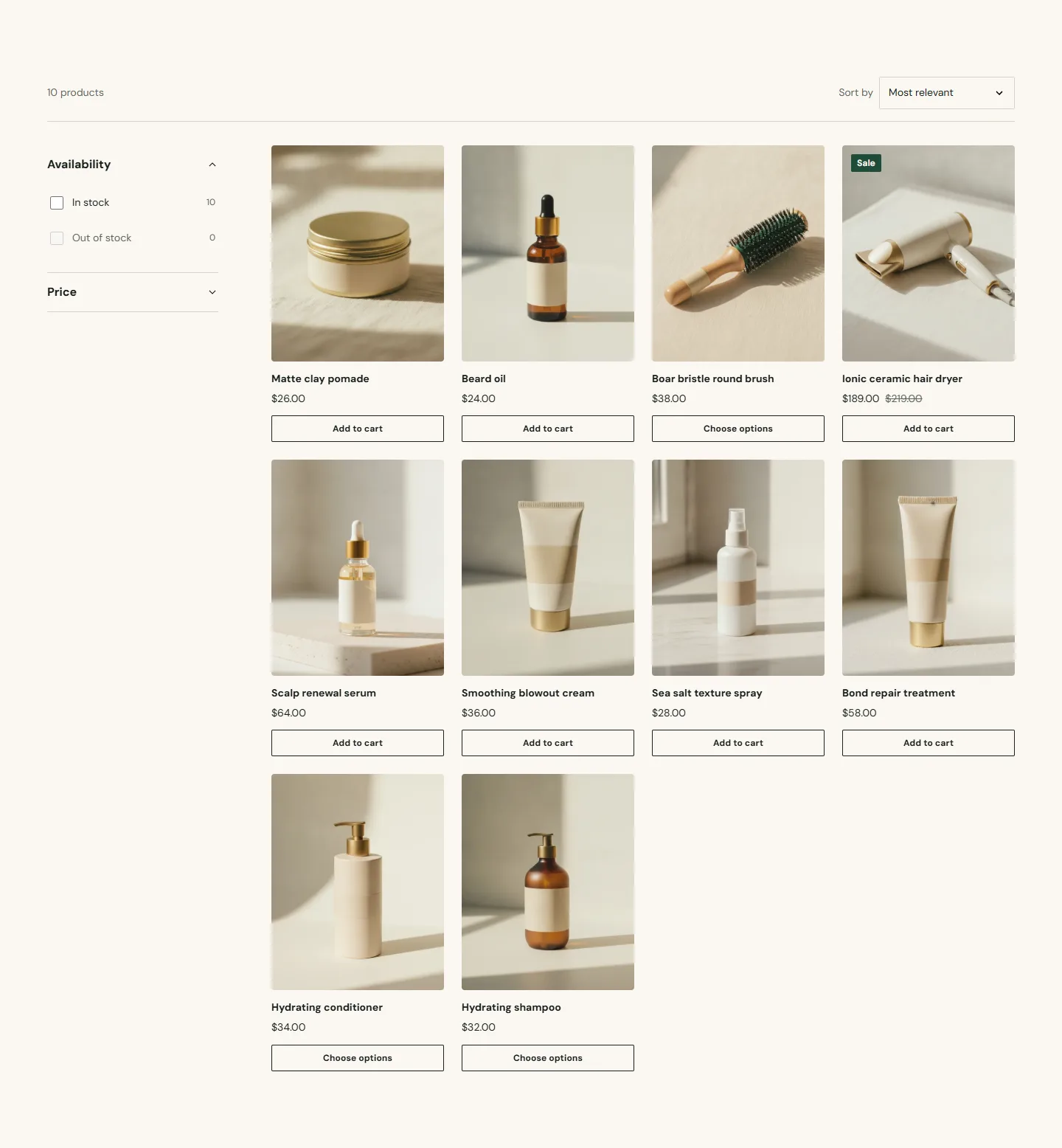
- Image ratio is Portrait, Square or Adapt to image. Portrait (four by five) suits bottles, tubes and boxes; Square suits jars and tools; Adapt to image keeps each product's own proportions, which only looks tidy if your photography is consistent.
- Show vendor prints the vendor name above the title. Turn it on if you sell several brands; leave it off if everything is your own line.
- Show second image on hover swaps to the product's second image when a desktop guest hovers. Good for showing texture or the back label.
- Show quick add button adds a button under the card. Single-variant products go straight to the cart; products with variants show a Choose options button that opens the product page.
- Show currency codes appends the currency code to prices (for example USD) everywhere prices appear. Turn it on if you sell in more than one currency.
Theme settings → Product cards
Every setting in this group- Image ratioChoice: Adapt to image, Portrait, Square · Portrait
- Show vendorCheckbox · Off
- Show second image on hoverCheckbox · On
- Show quick add buttonCheckbox · On
- Show currency codesCheckbox · Off
In the theme editorTheme settings with the Product cards group open. The settings sheet on this page lists every control in that panel by its label.
What a card shows
Title, price with compare-at price and sale badge when the product is on sale, unit price when it is set, and a sold-out badge when nothing is available. The image uses the product's featured image with its focal point, see Image sizes and focal points.
Columns
Columns are set per section, not here: Columns on desktop on the featured collection, the product grid and search results, and Columns on mobile on the product grid.