

A collection page in Atrium has two sections: the Collection banner at the top and the Product grid below it. Filters come from Shopify's Search and Discovery app, so they are the same filters your search page uses.
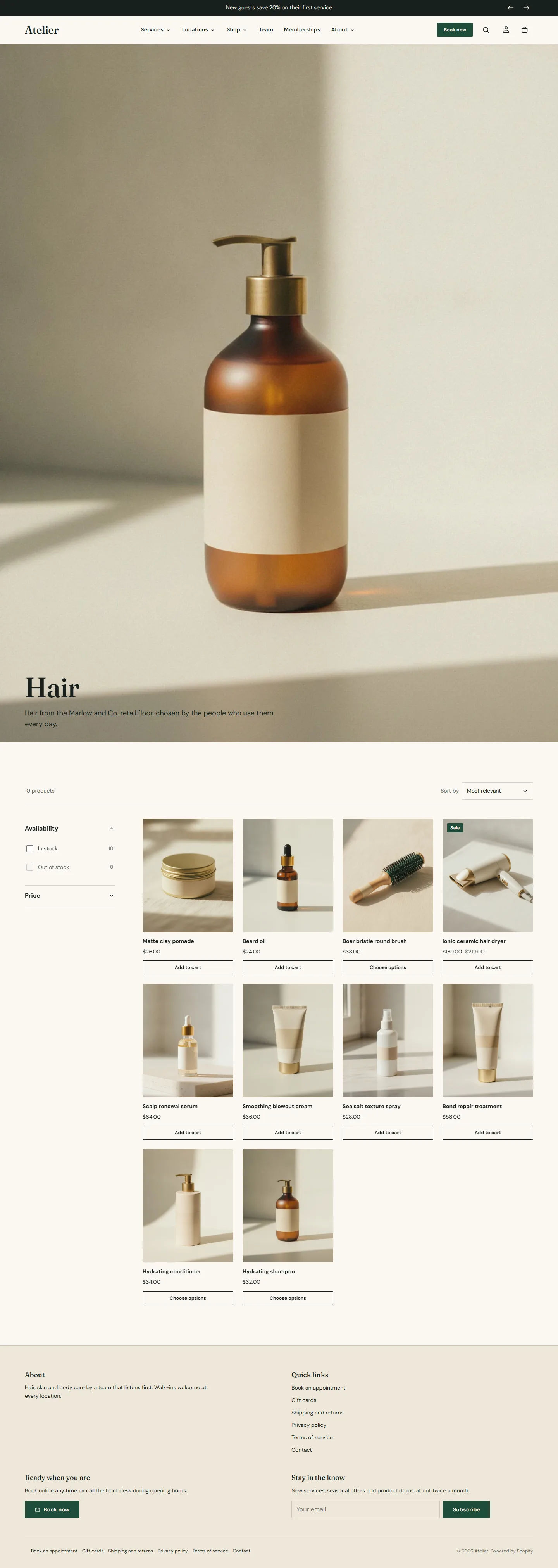
Collection banner
- Show collection description and Alignment.
- Use the collection image shows the image set on the collection in your admin, with Banner height (Small, Medium, Large) and an Overlay that tints it with the scheme background so the title stays readable. Without an image the banner is the title and description on the scheme color.
Collection banner section
Every setting, with its control and default- Color schemeColor scheme · Scheme 1
- Full widthCheckbox · Off
- Section paddingChoice: None, Small, Regular, Large · Small
- Show collection descriptionCheckbox · On
- AlignmentChoice: Left, Center · Left
- Use the collection imageCheckbox · OnShows the image set on the collection in your Shopify admin. Without an image the banner falls back to the title and description.
- Banner heightChoice: Small, Medium, Large · Medium
- OverlaySlider: 0 to 80 % · 40%Darkens or lightens the image using the color scheme background, so the title stays readable.
Product grid
- Enable filtering shows the filters you set up in the Search and Discovery app: availability, price, product type, vendor, and any option or metafield you added. Filter layout on desktop is Sidebar or Drawer; phones always use a drawer. Expand every filter group opens all groups by default.
- Enable sorting and Show number of products.
- Columns on desktop 2 to 5, Columns on mobile 1 or 2.
- Products per page, 8 to 48, and Show more products with: Numbered pages or a Load more button.
Filtering and sorting update the grid in place without reloading the page, and the address updates so a filtered view can be shared.
Product grid section
Every setting, with its control and default- Color schemeColor scheme · Scheme 1
- Full widthCheckbox · Off
- Section paddingChoice: None, Small, Regular, Large · Regular
- Enable filteringCheckbox · OnFilters come from the Search and Discovery app. Set them up in your Shopify admin.
- Filter layout on desktopChoice: Sidebar, Drawer · Sidebar
- Expand every filter groupCheckbox · Off
- Enable sortingCheckbox · On
- Show number of productsCheckbox · On
- Columns on desktopChoice: 2, 3, 4, 5 · 4
- Columns on mobileChoice: 1, 2 · 2
- Products per pageSlider: 8 to 48 · 24
- Show more products withChoice: Numbered pages, Load more button · Numbered pages
Collections list page
The Collections list section on the list-collections template shows every collection as a card. Sort collections by is alphabetical, product count, date added or Custom order, which uses Collection blocks so you choose which collections appear and in what order. Columns on desktop, Image ratio, Show number of products, Show collection description and Collections per page shape the grid.
Collections list section
Every setting, with its control and default- Color schemeColor scheme · Scheme 1
- Full widthCheckbox · Off
- Section paddingChoice: None, Small, Regular, Large · Regular
- HeadingText · Shop by category
- TextRich text · Everything our stylists and estheticians reach for, grouped the way we shop the back bar.
- Sort collections byChoice: Alphabetically, A to Z, Product count, high to low, Date added, newest first, Custom order · Alphabetically, A to ZChoose Custom order to pick the collections yourself with blocks.
- Columns on desktopChoice: 2, 3, 4 · 3
- Image ratioChoice: Portrait, Square, Landscape · Portrait
- Show number of productsCheckbox · On
- Show collection descriptionCheckbox · Off
- Collections per pageSlider: 6 to 36 · 12
Collection block
Up to 24 blocks in the section- CollectionCollection
- ImageImageOptional. Replaces the collection image on this card.
Featured collection and Collection list sections
Two sections for any page:
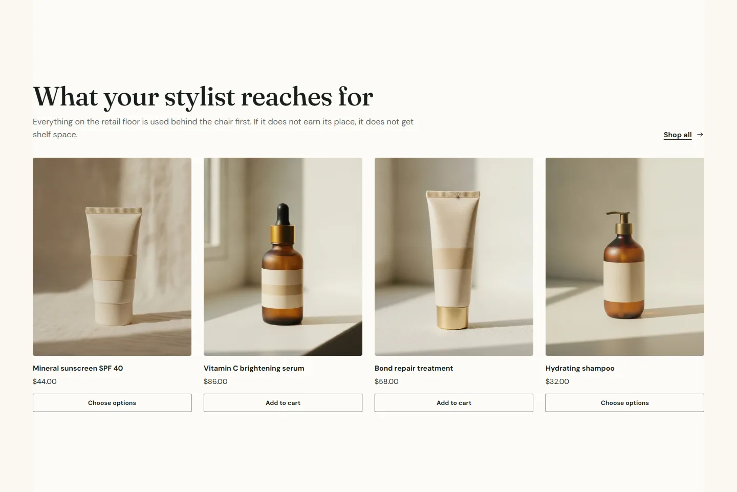
- Featured collection shows products from one Collection: Layout Grid or Scroll, Columns on desktop, Products to show and a Show link to the collection with its Link label. The demo home page uses it for the bestsellers shelf.
- Collection list shows several collections as cards, one Collection block each, with an optional Title and Image override per card, Layout, Columns on desktop, Image ratio and Show number of products.
Featured collection section
Every setting, with its control and default- Color schemeColor scheme · Scheme 1
- Full widthCheckbox · Off
- Section paddingChoice: None, Small, Regular, Large · Regular
- EyebrowText · Retail floor
- HeadingText · What your stylist reaches for
- TextRich text · Back-bar formulas we use in the chair, sized to take home. Ask your stylist to build your routine at your next visit.
- AlignmentChoice: Left, Center · Left
- CollectionCollection
- LayoutChoice: Grid, Scroll · Grid
- Columns on desktopChoice: 2, 3, 4, 5 · 4
- Products to showSlider: 2 to 16 · 8
- Show link to the collectionCheckbox · On
- Link labelText · See all products
Setting up filters
Install the free Search and Discovery app from Shopify, open Filters, and add the ones that suit a beauty retail catalog: Availability, Price, Product type, Vendor and an option such as Size or Scent. Filters with one value hide themselves on a collection where they have nothing to filter.