

Three groups under Theme settings set the rhythm of every page. Each preset ships its own values, and they are the fastest way to make the theme feel like yours without touching a single section.
Layout
- Page width is Narrow, Regular or Wide. Regular suits most stores. Wide gives grids a fifth column room; Narrow reads like a magazine.
- Side margin, 16 to 64 pixels, is the space between the page edge and the content on phones and on desktops below the page width.
- Space between sections is Compact, Regular or Spacious. Every section's Section padding setting (None, Small, Regular, Large) is relative to this, so one change here re-spaces the whole store.
- Grid spacing, 8 to 48 pixels, is the gap between cards, columns and gallery tiles.
Theme settings → Layout
Every setting in this group- Page widthChoice: Narrow, Regular, Wide · Regular
- Side marginSlider: 16 to 64 px · 24px
- Space between sectionsChoice: Compact, Regular, Spacious · Regular
- Grid spacingSlider: 8 to 48 px · 24px
Shapes and buttons
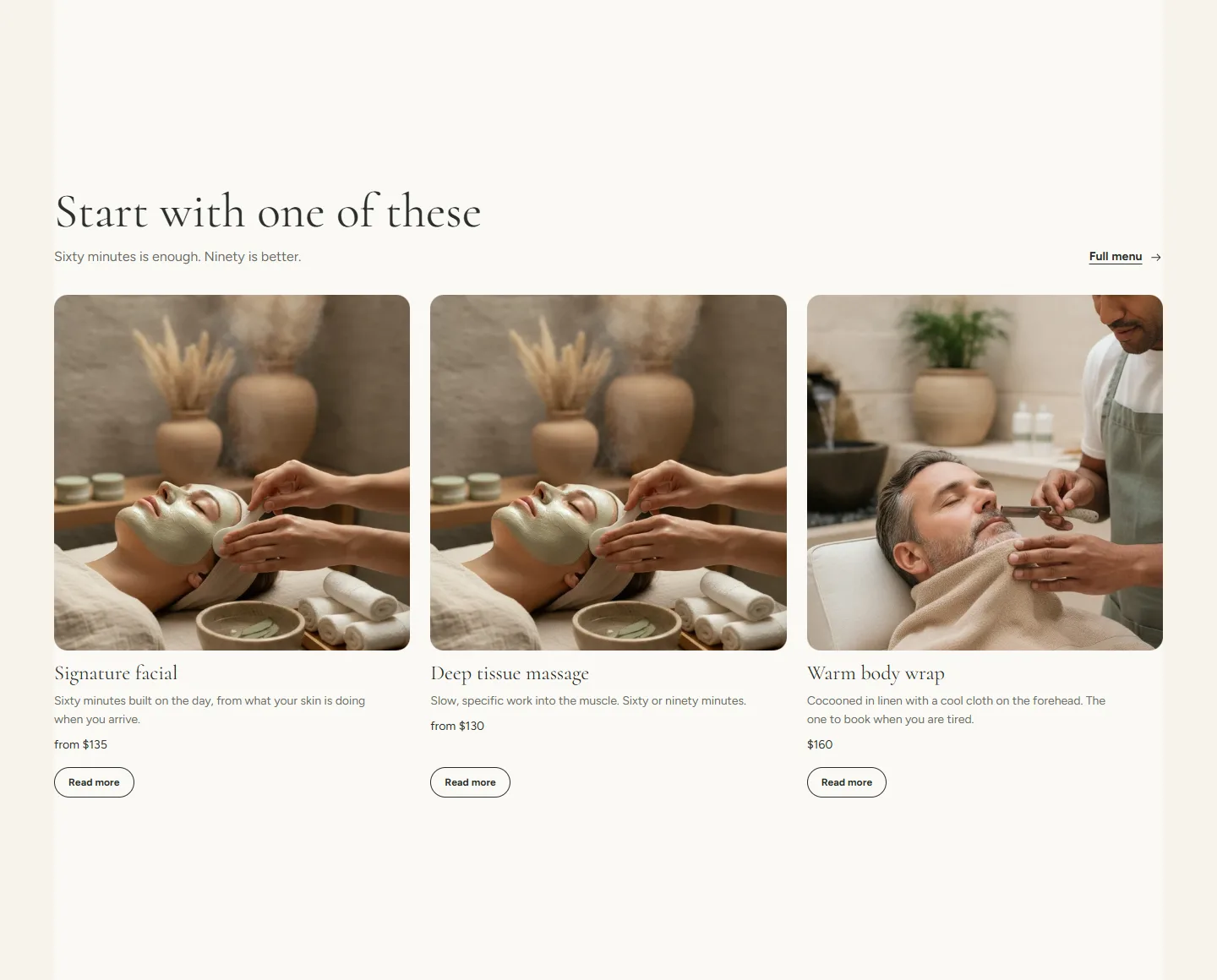
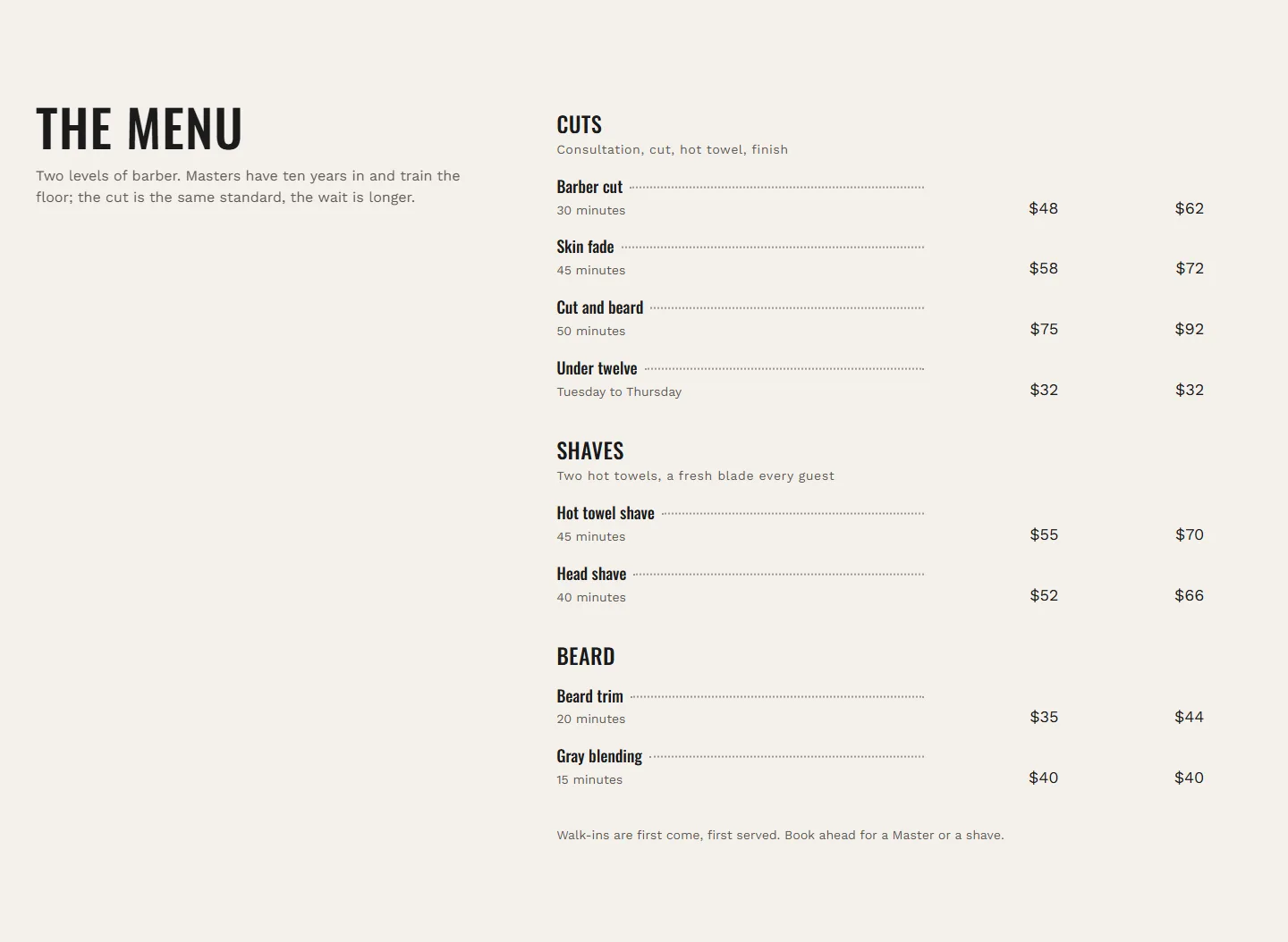
- Button and input corners, 0 to 32 pixels, rounds buttons, inputs and tags. At 32 the buttons are pills; Spa ships this. Barber ships 0.
- Image and card corners, 0 to 40 pixels, rounds images, cards and dialogs.
- Button style is Solid or Outline for the primary button. Secondary buttons are always the quieter of the two.
- Line weight is Hairline or Bold for rules, table lines and outlined buttons. Barber ships Bold.
Theme settings → Shapes and buttons
Every setting in this group- Button and input cornersSlider: 0 to 32 px · 2px
- Image and card cornersSlider: 0 to 40 px · 4px
- Button styleChoice: Solid, Outline · Solid
- Line weightChoice: Hairline, Bold · Hairline
Motion
- Enable animations turns the reveal motion on sections and cards on or off. Visitors who have asked their device to reduce motion never see animations, whatever this is set to.
- Image hover effect is None, Zoom or Lift for images inside cards on desktop. It never changes what is visible; it only moves on hover.
Autoplay for the hero and the announcement bar, and the logo marquee's scrolling, are set on those sections and also respect reduced motion.
Theme settings → Motion
Every setting in this group- Enable animationsCheckbox · OnAnimations are always disabled for visitors who have asked their device to reduce motion.
- Image hover effectChoice: None, Zoom, Lift · Zoom
In the theme editorTheme settings with the Layout, Shapes and buttons, and Motion groups. The settings sheet on this page lists every control in that panel by its label.
Per-section overrides
Every content section has three settings that work with the values above: Color scheme, Full width and Section padding. Full width lets a section's background run edge to edge while the content stays within the page width; the demo uses it for quotes, the call to action banner and the price menu on category pages.