

Atrium does not have a single background color or a single button color. It has five color schemes, and every section chooses one. Change a scheme under Theme settings → Colors and every section using it updates at once; change a section's Color scheme setting and only that section changes.
The roles in a scheme
Each scheme has eight colors. The labels are the ones you see in the editor:
| Role | Used for |
|---|---|
| Background | The section background. |
| Surface | Cards, inputs, table rows and anything that sits on the background. |
| Text | Headings and body text. |
| Secondary text | Captions, eyebrows, prices in menus, helper lines. |
| Borders and lines | Rules, dividers, input borders, table lines. |
| Buttons and accents | Solid buttons, the active state of controls, the before-and-after handle, marks. |
| Text on buttons | Text inside a solid button. |
| Links | Inline links in text. |
Theme settings → Colors
Every setting in this groupEach scheme has these roles:
- BackgroundColor
- SurfaceColor
- TextColor
- Secondary textColor
- Borders and linesColor
- Buttons and accentsColor
- Text on buttonsColor
- LinksColor
How the presets use them
Every preset ships its five schemes in the same order, so a section that looks right in one preset looks right after you switch:
- Scheme 1 is the page tone: oat in Atrium, bone in Barber, sand in Spa, porcelain in Clinic, warm off-white in Lash.
- Scheme 2 is a tinted white one step lighter than scheme 1. Sections alternate between 1 and 2 so pages have rhythm without hard bands. It is never pure white.
- Scheme 3 is a deeper tone of the page color, used for the footer, closing banners and the price menu on category pages.
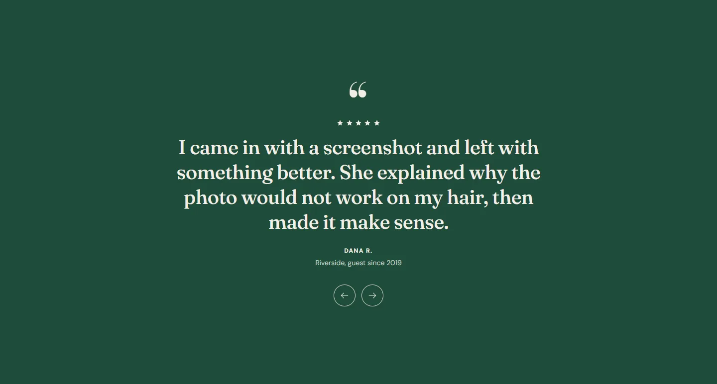
- Scheme 4 is the accent as a background with light text: deep green, oxblood, sage, teal or plum. Quotes and the home page banner use it.
- Scheme 5 is ink: the darkest scheme, used for the hero and the announcement bar.

Contrast
Every preset's schemes pass WCAG AA: 4.5:1 for text on background and on surface, and for text on buttons. If you change a color, keep those pairs at 4.5:1 or better. The Shopify color picker does not check this for you; a free contrast checker in your browser does. The pairs that fail most often after an edit are Secondary text on Surface and Text on buttons on Buttons and accents.
Choosing a scheme on a section
Every section has Color scheme at the top of its settings. Slides in the hero have their own Text color scheme, which sets the text color and the overlay tint over the image, so pick one whose Text reads clearly on the photo.
Sections that sit on an image (the hero, the call to action banner with a background image, the gift card band with Image behind text) also have an Overlay slider that darkens or lightens the image with the scheme's background color.
Adding or removing schemes
Shopify lets you add schemes in the Colors group with the plus button. Atrium's presets use five; a sixth is fine for a one-off section. Removing a scheme that sections still use makes those sections fall back to the first scheme, so check the pages that used it.