

Two fonts is the whole system, on purpose. Under Theme settings → Typography you choose one face for headings and one for body text from Shopify's font library, and four settings shape everything else.
Headings
- Heading font picks the face for every heading, from the hero headline to card titles. Shopify's library has several hundred faces; the presets use Fraunces (Atrium), Oswald (Barber), Cormorant (Spa), Figtree (Clinic) and Playfair Display (Lash).
- Heading size scales every heading together, from 80 to 140 percent. Use it to tune a face that runs large or small rather than changing each section.
- Heading case is As written or Uppercase. Barber ships uppercase; with a serif, leave it as written.
- Heading letter spacing runs from minus 4 to plus 8 percent. Negative values tighten display faces; uppercase text usually wants a positive value.
Body
- Body font is the face for paragraphs, menus, prices, buttons and inputs.
- Body text size from 14 to 19 pixels. Everything else in the type scale is relative to it, so nudging this one value resizes the whole store.
- Button font chooses whether buttons use the Body face or the Headings face. Headings on buttons suits condensed faces like Oswald; body suits everything else.
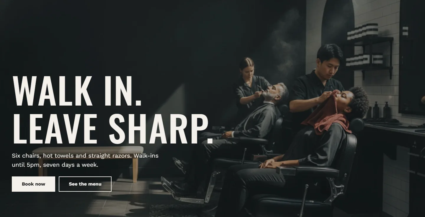
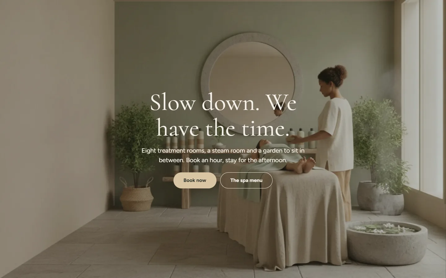
Theme settings → Typography
Every setting in this group- Heading fontFont · fraunces_n5
- Heading sizeSlider: 80 to 140 % · 100%
- Heading caseChoice: As written, Uppercase · As written
- Heading letter spacingSlider: -4 to 8 % · -1%
- Body fontFont · dm_sans_n4
- Body text sizeSlider: 14 to 19 px · 16px
- Button fontChoice: Body, Headings · Body
Weights and styles
Atrium loads the regular and bold weights and the italic of each face, so bold and italic text in rich text fields render in the right face rather than a synthetic version. Pick a face that has those styles; the font picker shows what each family offers.
Custom font files
Uploading your own font files is not supported, which is a Theme Store rule as well as a performance choice: Shopify serves its library fonts from its own network with the right caching. If your brand face is not in the library, choose the closest library face and keep the brand face for your logo image.
Sizes in sections
Headings inside sections have their own size choices where it matters: the hero's Heading size (Large, Extra large, Display), the rich text and image with text heading blocks (Size), the call to action banner and the email signup (Heading size). These pick a step on the scale; Heading size under Theme settings then scales all of them together.