

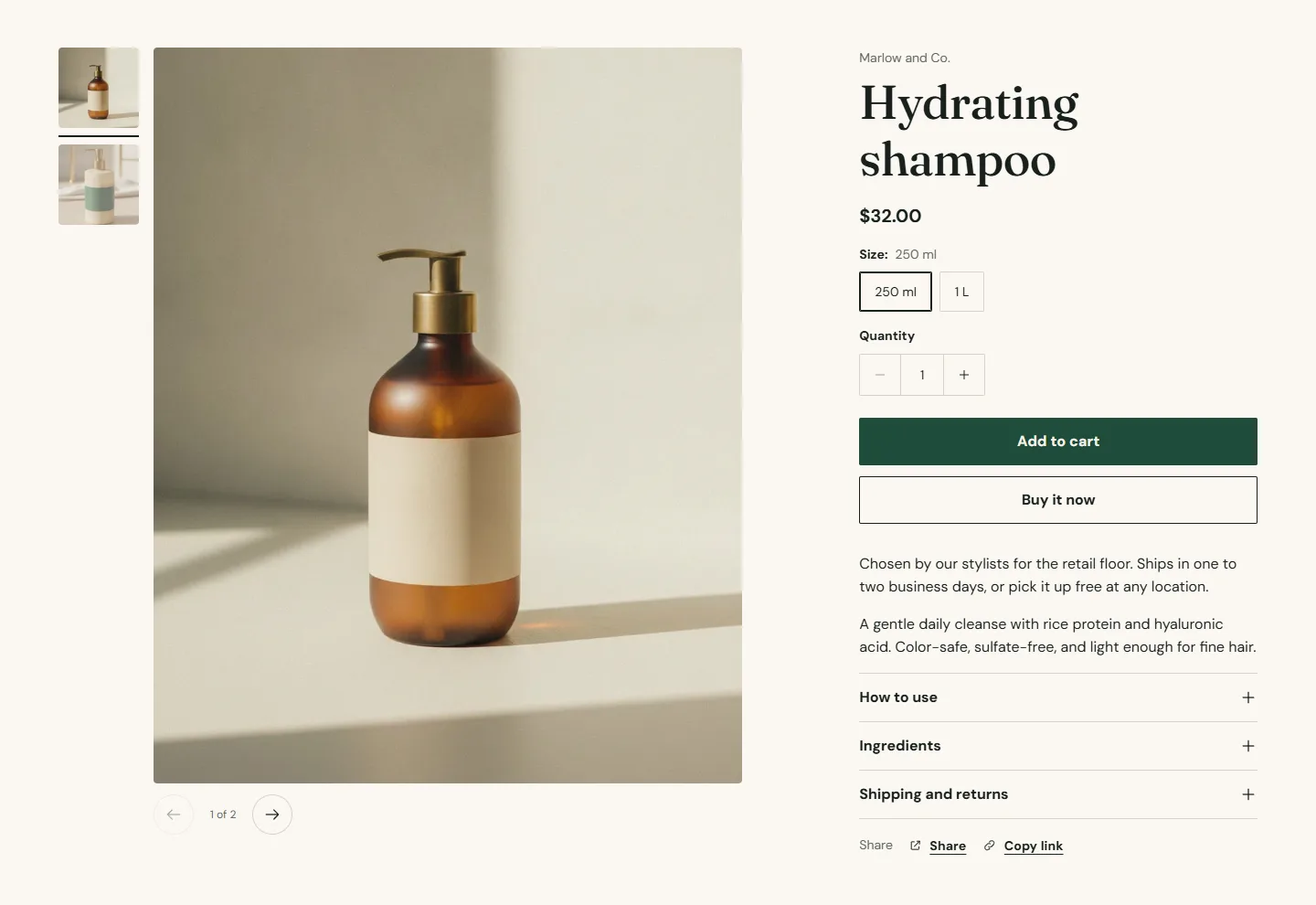
The Product information section holds the product page. Everything beside the gallery is a block, so you decide the order: vendor above the title or below it, the description before the buy buttons or after, a collapsible row for ingredients, an app block for reviews.
Section settings
- Gallery layout is Thumbnails on the left, Thumbnails below or Grid. Grid shows every image at full width in a two-column mosaic.
- Open images full screen lets guests tap an image to see it large.
- Loop videos repeats product videos.
- Keep details in view while scrolling pins the details column while a long gallery scrolls.
Product information section
Every setting, with its control and default- Color schemeColor scheme · Scheme 1
- Section paddingChoice: None, Small, Regular, Large · Small
- Gallery layoutChoice: Thumbnails on the left, Thumbnails below, Grid · Thumbnails on the left
- Open images full screenCheckbox · On
- Loop videosCheckbox · Off
- Keep details in view while scrollingCheckbox · On
Blocks
- Title with a Title size.
- Price with Show tax and shipping note, which only appears when your store includes tax in prices or has a shipping policy.
- Vendor and SKU.
- Text, rich text with a Text size, for a line such as Ships in one to two business days.
- Variant picker with Style (Buttons or Dropdown) and Swatch shape. See Variants and swatches.
- Quantity.
- Buy buttons with Show dynamic checkout buttons (Shop Pay, PayPal, Apple Pay) and Show Shop Pay Installments. Subscriptions appear here when a selling plan app is installed. See Subscriptions.
- Pickup availability shows which locations have the item for pickup, from your Shopify locations.
- Description renders the product description.
- Collapsible row, as many as you like: a Heading, rich Content or a Page whose content is shown instead, and Open by default. Ingredients, how to use, shipping and returns. Connect Content to a metafield with the dynamic source button to fill it per product.
- Share with copy link and social buttons.
- Custom Liquid for app snippets or code.
- App blocks from installed apps.
Product information section
Every setting, with its control and default- Color schemeColor scheme · Scheme 1
- Section paddingChoice: None, Small, Regular, Large · Small
- Gallery layoutChoice: Thumbnails on the left, Thumbnails below, Grid · Thumbnails on the left
- Open images full screenCheckbox · On
- Loop videosCheckbox · Off
- Keep details in view while scrollingCheckbox · On
Title block
Up to 1 per section- Title sizeChoice: Large, Medium, Small · Medium
Price block
Up to 1 per section- Show tax and shipping noteCheckbox · OnShows only when your store includes tax in prices or has a shipping policy.
Text block
Up to 50 blocks in the section- TextRich text · Stylist recommended. Ships in one to two business days, or pick up free at any of our locations.
- Text sizeChoice: Small, Medium, Large · Medium
Variant picker block
Up to 1 per section- StyleChoice: Buttons, Dropdown · Buttons
- Swatch shapeChoice: Circle, Square · CircleApplies to option values that have a swatch set in your product options.
Buy buttons block
Up to 1 per section- Show dynamic checkout buttonsCheckbox · OnShoppers see the payment method they already use, such as Shop Pay, PayPal or Apple Pay.
- Show Shop Pay InstallmentsCheckbox · On
Collapsible row block
Up to 50 blocks in the section- HeadingText · How to useLeave blank to use the page title.
- ContentRich text · Apply a small amount to damp, towel-dried hair from mid-lengths to ends. Comb through and style as usual. Fine hair: start with less and build up.
- PagePage
- Open by defaultCheckbox · Off
Custom Liquid block
Up to 50 blocks in the section- Liquid codeLiquidAdd app snippets or other Liquid code to create advanced customizations.
Recommendations
Two Product recommendations sections sit under the product in the demo. Recommendation type is Related products, chosen by Shopify from purchase and browsing data, or Complementary products, which you set per product in the Search and Discovery app. Each has a Heading, Heading size, Products to show and Columns on desktop. Related products need a few days of orders before they mean much; complementary products work from day one.
Product recommendations section
Every setting, with its control and default- Color schemeColor scheme · Scheme 1
- Full widthCheckbox · Off
- Section paddingChoice: None, Small, Regular, Large · Regular
- Recommendation typeChoice: Related products, Complementary products · Related productsRelated products are chosen by Shopify. Complementary products come from the Search and Discovery app.
- HeadingText · You may also like
- Heading sizeChoice: Small, Medium, Large · Medium
- TextRich text
- AlignmentChoice: Left, Center · Left
- Products to showSlider: 2 to 10 · 4
- Columns on desktopSlider: 2 to 5 · 4Applies to related products only. Complementary products always show as a list.
Media
Product media supports images, Shopify-hosted video, YouTube and Vimeo links and 3D models. Variant images switch the gallery when a variant is chosen. See Video and Image sizes and focal points.