

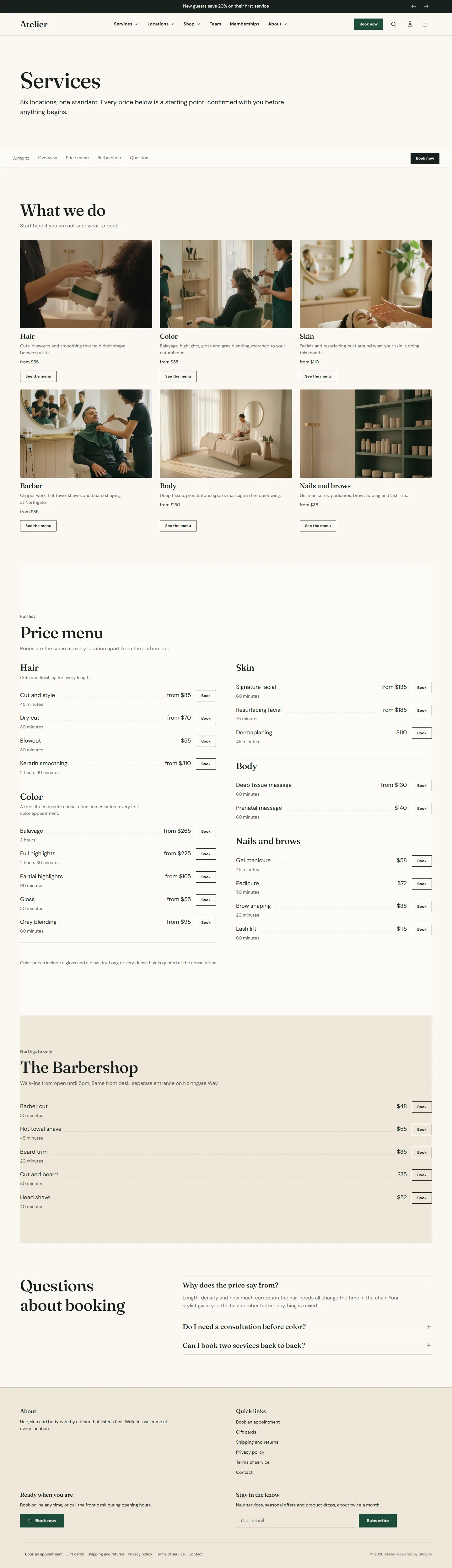
Services are content, not products, so they live in sections rather than in your catalog. The services page is the overview: a jump menu, a card per category and the full priced menu. The demo builds it on a page template called services.
Make the template
- Open the theme editor on any page and choose Pages in the top bar, then Create template. Base it on the default page template and name it services.
- Add the sections below in order.
- Under Online Store → Pages, create a page called Services and set Theme template to services.
Rich text
Eyebrow, Heading and Text blocks for the introduction. Set the Heading block's HTML tag to H1 so the page has one main heading, and Content width to Wide.
Services nav
A row of links that sticks under the header while the guest scrolls, so a long page stays navigable.
- Stick to the top while scrolling keeps the bar visible once the guest scrolls past it.
- Label is the short word before the links (Jump to, On this page). Screen reader label names the navigation for assistive technology.
- Show a booking button adds the Book button to the bar, with Location name and Booking center ID for pages that belong to one location.
- Link blocks: each has a Label, a Section anchor and a Link. An anchor is the id of a section on this page without the hash, for example shopify-section-menu-hair; it wins over the link. To find a section's id, open the page on your storefront, right-click the section and choose Inspect: the wrapper's id starts with shopify-section-. A Link goes to another page.
Services nav section
Every setting, with its control and default- Color schemeColor scheme · Scheme 1
- Stick to the top while scrollingCheckbox · OnThe bar sits under the header once the shopper scrolls past it.
- LabelText · On this page
- Screen reader labelText · On this pageDescribes this navigation to assistive technology.
- Show a booking buttonCheckbox · On
- Location nameText
- Booking center IDTextThe provider ID for this location. Leave blank to use the default from theme settings.
Link block
Up to 50 blocks in the section- LabelText · Hair
- Section anchorTextA section id on this page, without the hash, for example shopify-section-menu-hair. It wins over the link below.
- LinkLinkUsed when no anchor is set.

Services grid
One card per category, linking to that category's page. Each Service block has an Image, Title, Description, Price from as text, and either a Booking ID with Link type for a direct booking, or a Link to a page. On the services page, use the Link so the card leads to the category page; the booking happens there.
- Layout is Grid or Scrolling row. Columns on desktop 2, 3 or 4.
- Card style is Image above text or Text over image. Image shape Landscape, Square or Portrait.
- Card link label is the label on cards that link to a page, for example See the menu. Cards with a booking ID show the booking button instead.
Services grid section
Every setting, with its control and default- Color schemeColor scheme · Scheme 1
- Full widthCheckbox · Off
- Section paddingChoice: None, Small, Regular, Large · Regular
- EyebrowText
- HeadingText · What we do
- Intro textRich text
- Heading alignmentChoice: Left, Center · Left
- Heading link labelText
- Heading linkLink
- LayoutChoice: Grid, Scrolling row · Grid
- Columns on desktopChoice: 2, 3, 4 · 3
- Card styleChoice: Image above text, Text over image · Image above text
- Image shapeChoice: Landscape, Square, Portrait · Landscape
- Card link labelText · View servicesUsed when a card has its own link instead of a booking ID.
- Location nameText
- Booking center IDTextThe provider ID for this location. Leave blank to use the default from theme settings.
Service block
Up to 50 blocks in the section- ImageImage
- TitleText · Color
- DescriptionText · Balayage, gloss, gray blending and full highlights, matched to your natural tone.
- Price fromText · from $145Plain text, for example from $145.
- Booking IDTextThe service or category ID from your booking provider.
- Link typeChoice: Booking home, Service, Category, Membership, Series package, Day package · Category
- LinkLinkPoint at a page or another booking provider. It replaces the built link.
Service menu
The full price list. See Service menu section for every setting. On the services page the demo uses Layout Open list, Two columns on desktop on and a Book button on every row.
Questions
A FAQ section with the three questions the front desk answers most about booking.
Keep it to fifty blocks
Shopify allows fifty blocks per section. A menu with more services than that belongs on the category pages; the services page shows the headline services and links down.