

The demo store is a fictional six-location salon group called Marlow and Co. This guide walks through it page by page, in the order the sections sit in the theme editor, and names the setting values the demo uses. Follow it once with your own content and you will have touched every part of the theme.
Two things before you start:
- Content lives in three places. Text, images and prices for services, locations and offers are section blocks in the theme editor. Products, collections, pages, blog posts and menus are created in your Shopify admin. Experts can be either.
- Pages need a template. Several demo pages use a page template (location, service category, service, services, team, offers, memberships, faq, contact, careers, about). Create the template in the editor first, then assign it to the page under Online Store → Pages → Theme template. Every page that uses the same template shares the same sections, so the demo creates one template per location and per service category.
Global setup
- Theme settings → Booking. Enter your Booking site address and Default center ID. The demo uses placeholder IDs; yours come from Zenoti, see Where to find Zenoti IDs. Leave Book button label as Book now.
- Theme settings → Colors. The Atrium preset ships five schemes: scheme 1 is oat, scheme 2 a tinted white one step lighter, scheme 3 sand, scheme 4 deep green with light text, scheme 5 ink. The demo uses 1 and 2 for most sections, 3 for the footer and the closing banners, 4 for quotes and 5 for the hero.
- Theme settings → Typography. Fraunces for headings, DM Sans for body, Heading size 100 percent, Heading letter spacing minus 1.
- Theme settings → Layout. Page width Regular, Side margin 24, Space between sections Regular, Grid spacing 24.
- Theme settings → Favicon and Social media. Upload a square favicon and paste your profile links; the footer and the announcement bar read them.
Header group
The header group holds the announcement bar and the header. It shows on every page, so it is the first thing to set.
- Announcement bar. Two Announcement blocks: "New guests save 20% on their first service" and "Free shipping on orders over $75". Rotate announcements every 6 seconds, Show social media icons on, Color scheme scheme 5.
- Header. Upload the Logo at Logo width 140. Menu is Main menu, Menu alignment Center, Sticky header Show when scrolling up. Show Book now button and Show search are on.
- Header → Menu feature block. Show under menu item 1 (Services), an image, Heading New guest offer, Text Save 20% on your first visit at any location, Link label See the offer.
- Header → Menu location blocks. Six blocks, all with Show under menu item 2 (Locations), each with a photo, Location name, Area (Flagship, Salon and spa, Barbershop, and so on), Address, Phone number and the Link to that location's page. Show images for location entries stays on so the menu shows the photos.


Home page
- Hero. One Slide block. Heading "Booked by people who remember how you take your coffee", Heading size Extra large, Heading level H1, Text color scheme scheme 5, Overlay 30, Height Large, Minimum height on mobile 600. Use the booking button on, Second button label Explore services linking to the services page. Change slide every stays at 0.
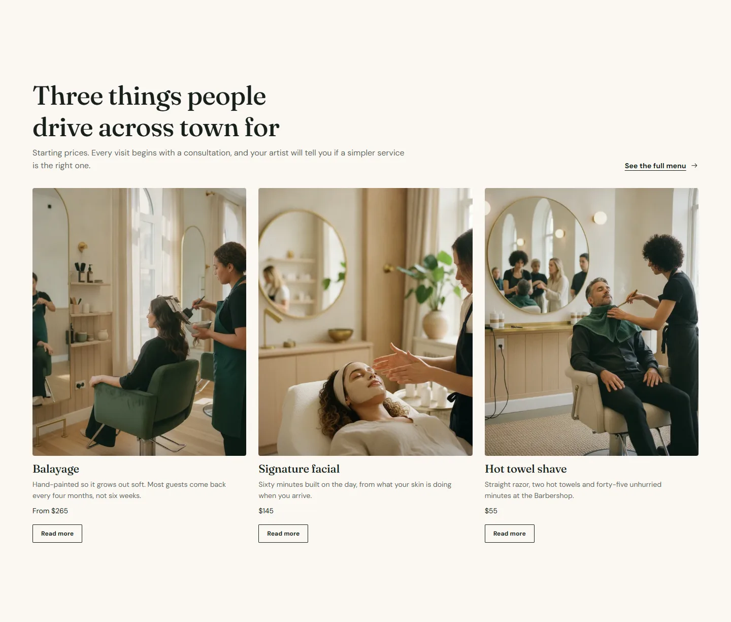
- Services grid. Heading "Three things people drive across town for", Layout Scrolling row, Columns on desktop 3, Card style Image above text, Image shape Portrait, Card link label Read more, Heading link label See the full menu linking to /pages/services. Three Service blocks: Balayage from $265, Signature facial $145, Hot towel shave $55, each with a portrait image and a Link to its service page.
- Image with text. Color scheme scheme 2, Image shape Portrait, Column split Narrow image, wide text, Image position on desktop Left. Blocks: Heading "We would rather talk you out of it" at size Extra large, one Text block, a Buttons block with First button label Read our story linking to /pages/about.
- Testimonials. Color scheme scheme 4, Layout One large quote at a time, Heading alignment Center, Full width on. Three Quote blocks with Name, Location or role and Rating 5.
- Locations grid. Heading "Six neighborhoods, one standard", Layout Grid, Columns on desktop 3, Heading link label Find the nearest linking to /pages/locations. Six Location blocks with Name, Area, Address line, Phone number, Location page and Booking center ID.
- Featured collection. Heading "What your stylist reaches for", Collection Bestsellers, Layout Scroll, Columns on desktop 4, Products to show 8, Link label Shop all.
- Logo marquee. Heading As seen in, Scroll the logos on, Time for one full pass 40. Five Logo blocks; the demo uses Publication name only, so the names render as text.
- Call to action banner. Color scheme scheme 4, Heading "Your first visit is twenty percent off", Use the booking button on, Location name for tracking homepage, Second button label Browse gift cards linking to the gift card product, Layout Buttons on the right, Full width on.

Services page
Template: services. Create it from the page template, then assign it to a page called Services.
- Rich text. Eyebrow, Heading and Text blocks introducing the menu. Content width Wide, Alignment Left.
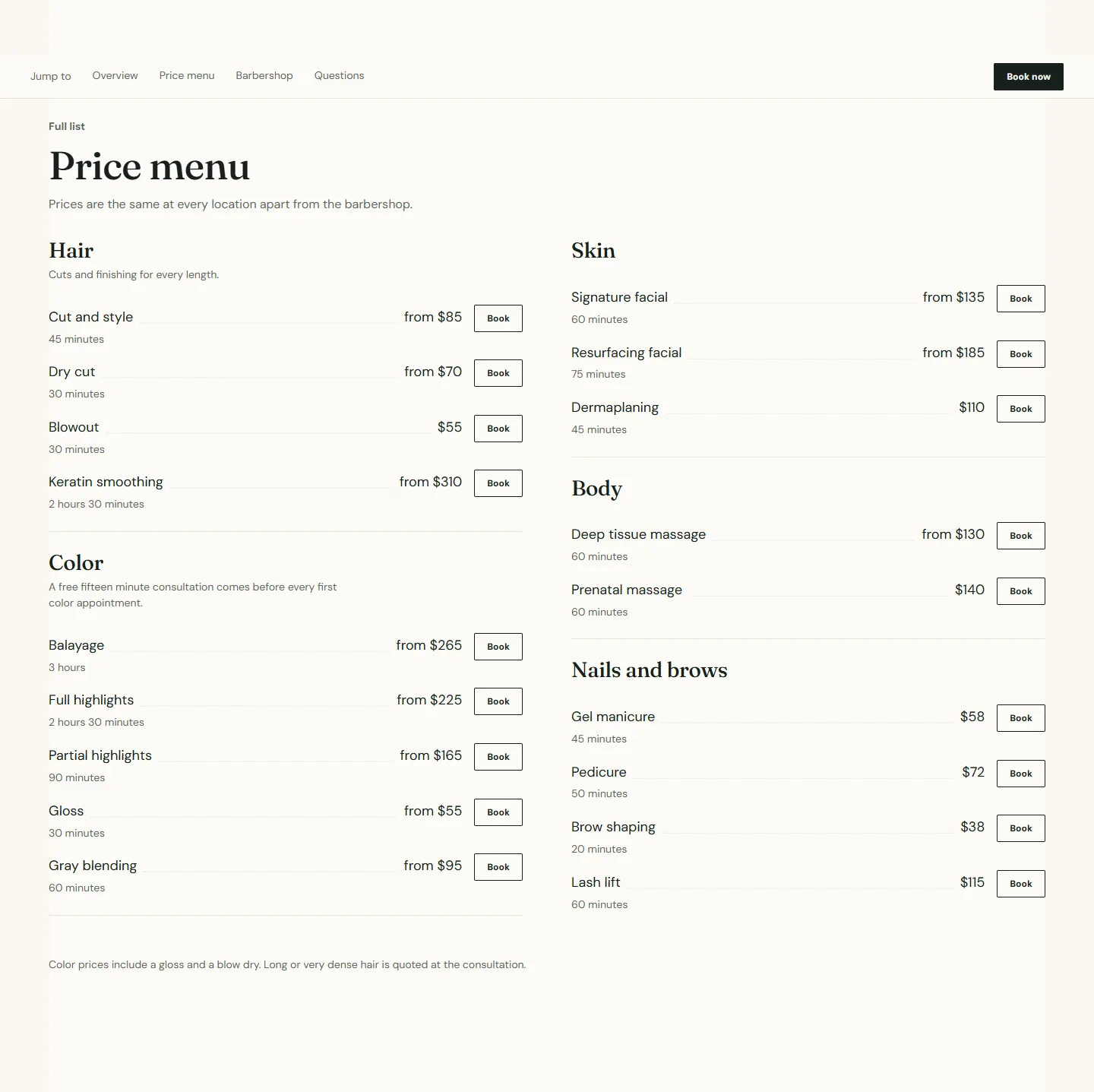
- Services nav. Label Jump to, Screen reader label Service categories, Stick to the top while scrolling on, Show a booking button on. Four Link blocks; the first points at the grid below with Section anchor shopify-section-grid, the others at the two menus and the questions.
- Services grid. Heading What we do, Layout Grid, Columns on desktop 3, Card link label See the menu. Six Service blocks, one per top-level category (Hair, Color, Skin, Body, Nails, Barbering), each with Link type Booking home and a Link to the category page.
- Service menu, "Price menu". Layout Open list, Open categories All open, Two columns on desktop on, Show a button on every service on, Show a booking bar on mobile on. Five Category blocks followed by their Service blocks (18 in the demo). Each Service block has Service name, Duration, Price as text such as from $85, and a Booking ID.
- Service menu, "The Barbershop". A second menu with Eyebrow Northgate only, Location name The Barbershop at Northgate, five Service blocks.
- FAQ. Heading Questions about booking, Layout Heading beside questions, three Question blocks.

Category pages
Template: service-category, one template per category. The demo has ten: cut-and-style, hair-color, hair-treatments, hair-extensions, barbering, skin, waxing, lash-and-brow, massage and nails. Build the first, then duplicate the template for the rest and change the content.
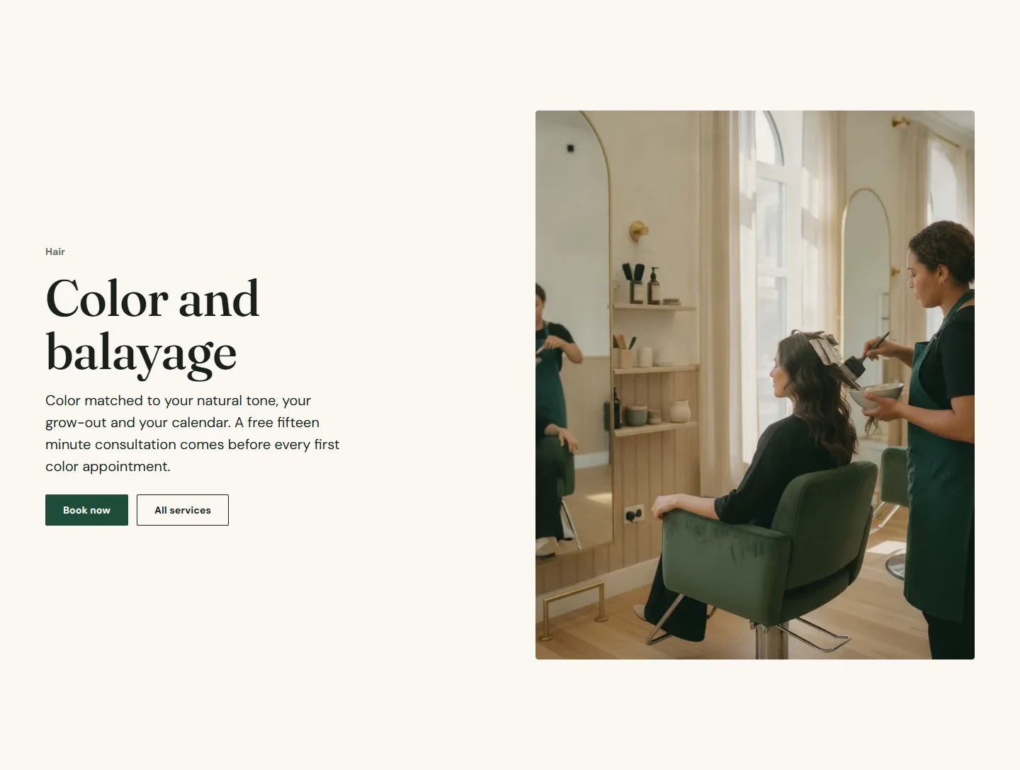
- Image with text. Eyebrow block with the parent category (Hair), Heading block with the category name at Heading level H1, a Text block with the opener and a Buttons block with Use the booking button on. Image position on desktop Right.
- Service menu. Eyebrow The menu, Heading such as "Color and balayage, priced", Layout Open list, Two columns on desktop on, Full width on, Color scheme scheme 3. Category blocks for each group (Base color, Highlights, Correction) with their Service blocks.
- Before and after. Heading What it looks like on real guests, Columns on desktop 2, Image shape Portrait, Starting position of the handle 50, Disclaimer "Individual results vary. Photos are of real guests, shared with permission." Two Pair blocks with Before image, After image, Caption and Treatment or concern.
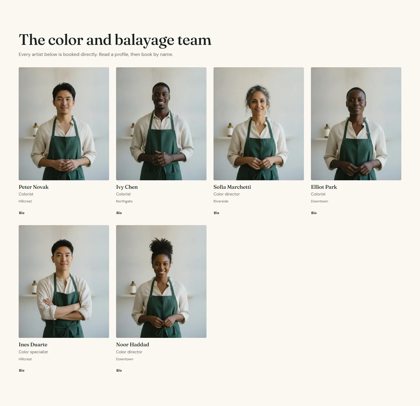
- Team grid. Experts come from A collection of products, Collection Team, Experts per page 60, Link cards to profile pages on, Show only these roles "Color director, Colorist, Color specialist" so the page shows only the color team.
- Testimonials. One large quote, scheme 4, full width.
- FAQ. Heading "Before you book color and balayage", Add FAQ structured data on, three Question blocks.
- Services grid, "Often booked with it". Three Service blocks linking to related category pages, Image shape Landscape, Heading link label All services.
- Call to action banner. Heading Ready when you are, Second button label Meet the team.
Service detail pages
Template: service. The demo has three: balayage, signature-facial and hot-towel-shave.
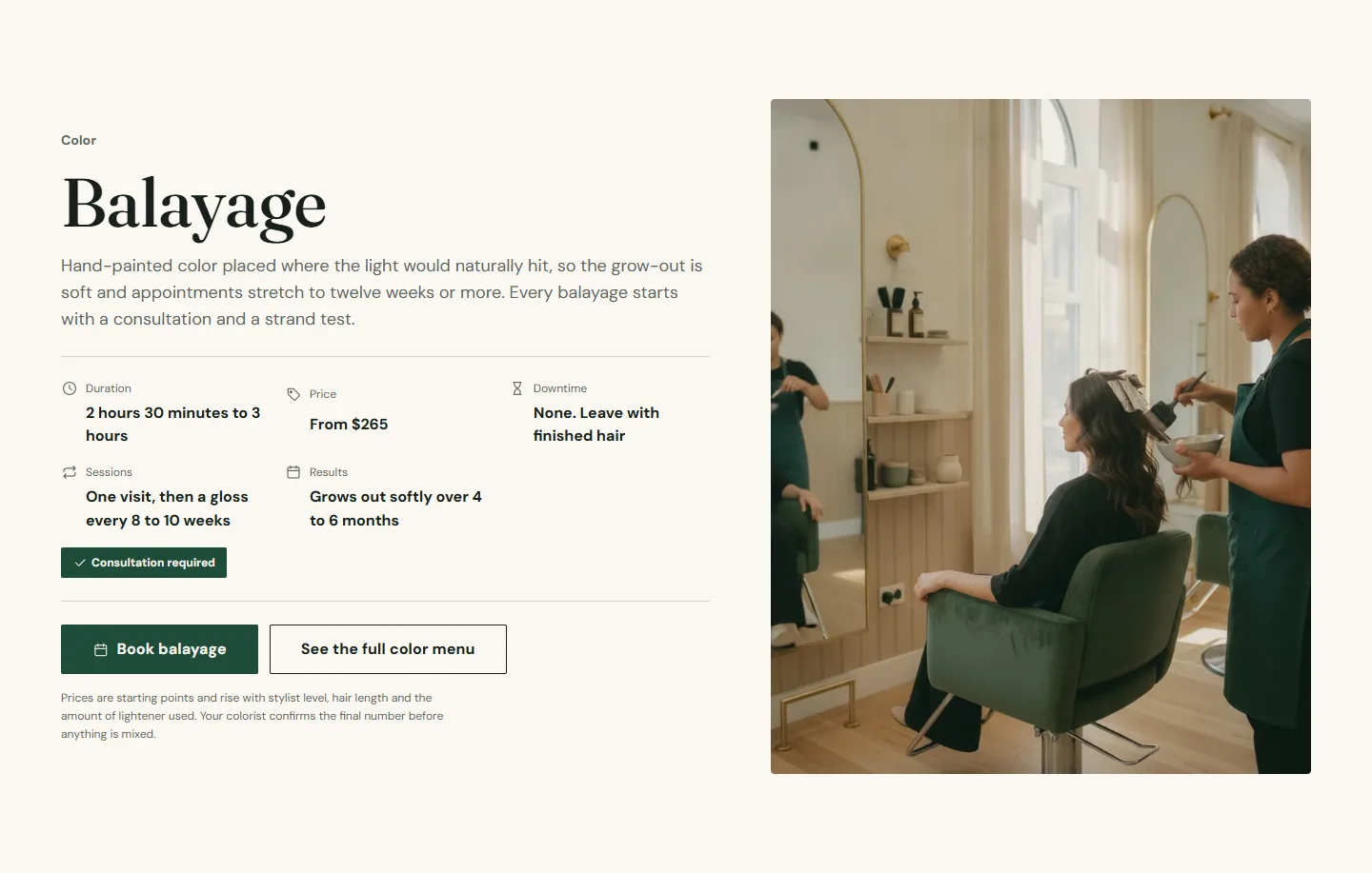
- Service facts. Uses the page title as the heading and the page content as the description. Category Color, Duration "2 hours 30 minutes to 3 hours", Price From $265, Downtime "None. Leave with finished hair", Sessions, Results, Consultation required on. Button label Book balayage, Booking link type Service with the service's Booking ID, Secondary link label See the full color menu. Media position Right of the text.
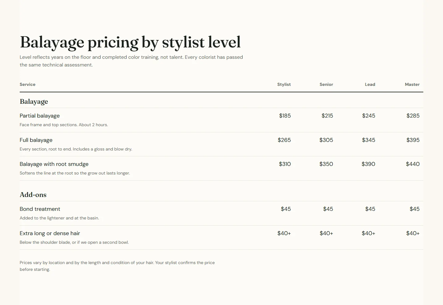
- Price table. Heading "Balayage pricing by stylist level", Price columns 4 labeled Stylist, Senior, Lead, Master. Group blocks for Balayage and Add-ons, Row blocks with a value per column.
- Before and after, Testimonials (grid, two columns), FAQ and Call to action banner as on the category page.
Location pages
Template: location, one template per location. The demo has six.
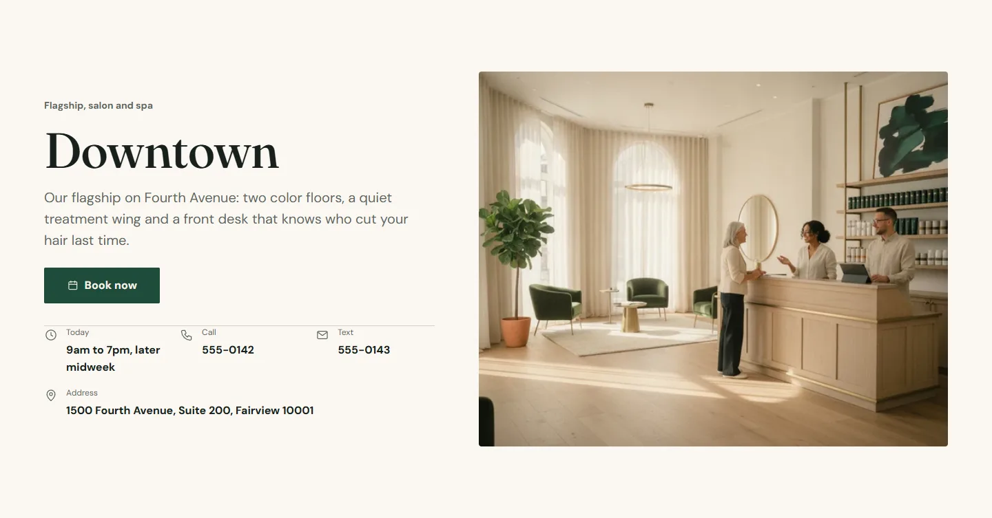
- Location hero. Location name Downtown, Subtitle "Flagship, salon and spa", Intro text, Booking center ID for this center, Address, Phone number, Text number, Hours summary "9am to 7pm, later midweek", Directions link, Image position Right. Add up to six Image slide blocks for a small carousel.
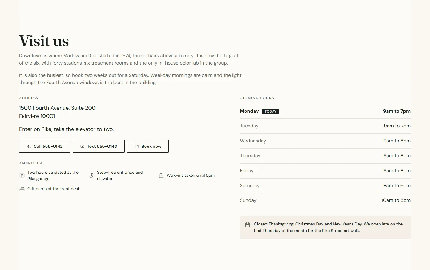
- Location details. Heading Visit us, Intro text, the same Location name and Booking center ID, Address, Directions link, Phone number, Text number. Seven Day blocks with Day name, Weekday and Hours (or Closed all day), then Amenity blocks: Parking, Step-free access, Wi-Fi and Kids welcome with a line of text each. Add a Holiday note for seasonal hours.
- Gallery. Three Image blocks, the first with Tile size Feature.
- Service menu. Eyebrow Downtown, Heading What we do here, Layout Collapsible, Open categories First open, Location name Downtown and this location's Booking center ID so every row books here.
- Team grid. Source A collection of products, Show only these locations Downtown.
- Testimonials, FAQ ("Before you come in": parking, step-free access, children), Locations grid ("Also nearby", the three closest locations) and a Call to action banner with Location name for tracking Downtown.
Locations page
Template: locations.
- Rich text intro.
- Location finder. Show search box, Show region filter and Show the Use my location button on, Distance unit Miles, Layout Grid, Columns on desktop 3. Six Location blocks with Name, Area, Region (Central, North, East), Address line, ZIP or postal code, Phone number, Hours summary, Latitude, Longitude, Location page, Directions link and Booking center ID.
- FAQ "Choosing a location".
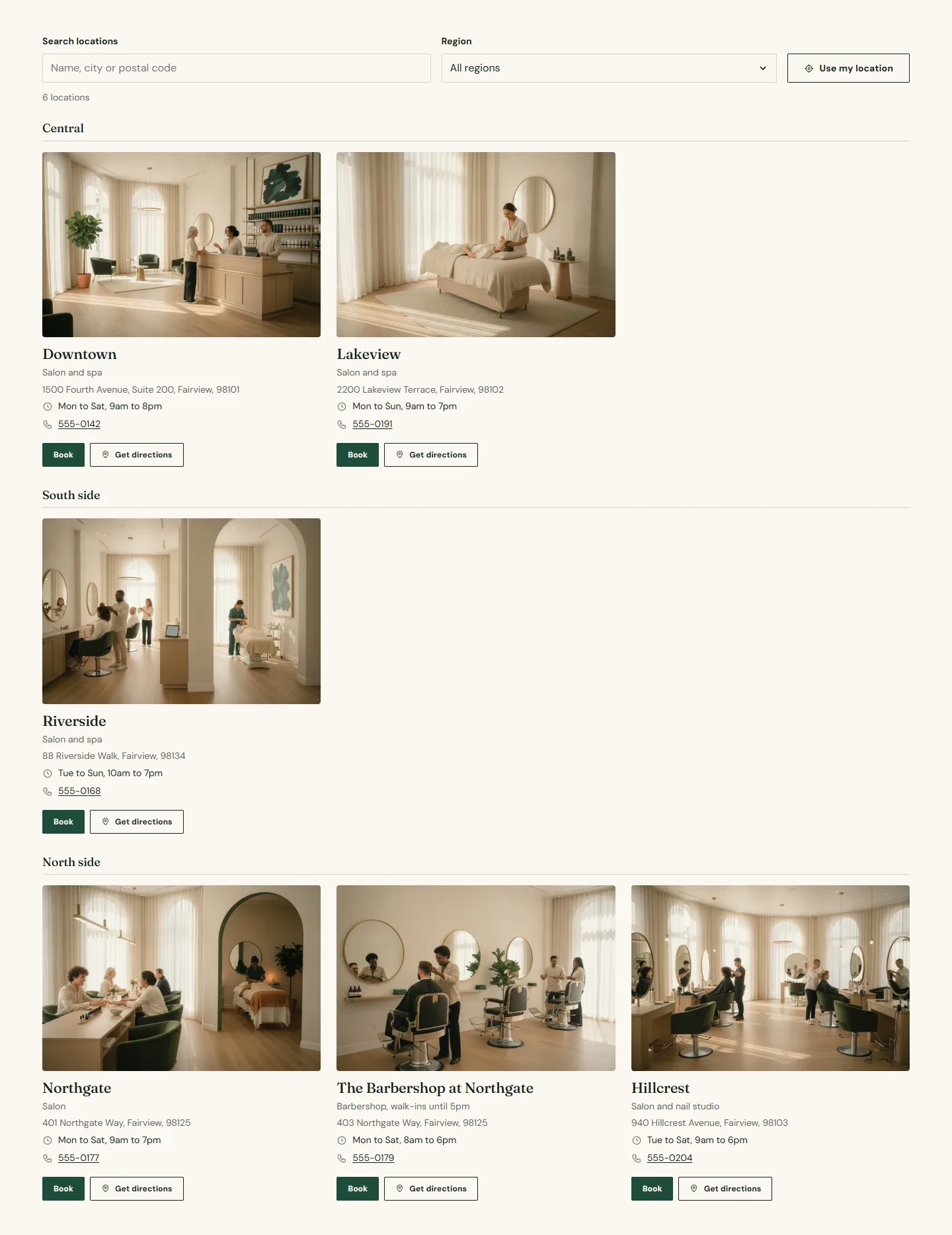
Overlay group: the booking picker
- Open the Booking picker from the overlay group at the bottom of the section list. Heading Choose a location, Show phone numbers on. Six Location blocks with Name, Area (the street address), Phone number and Booking center ID. This dialog opens whenever a guest taps a Book button that has no location of its own, so keep it in step with the finder.
Team page and expert profiles
Template: team. The demo drives the team from a collection, see Expert directory with metafields for the metafield setup.
- Rich text intro.
- Team grid. Experts come from A collection of products, Collection Team, Experts per page 60, Show filters on, Columns on desktop 4. The twelve Person blocks in the template are ignored while a collection is used; they are there so the page works the moment you switch Experts come from back to blocks.
- FAQ "Choosing someone".
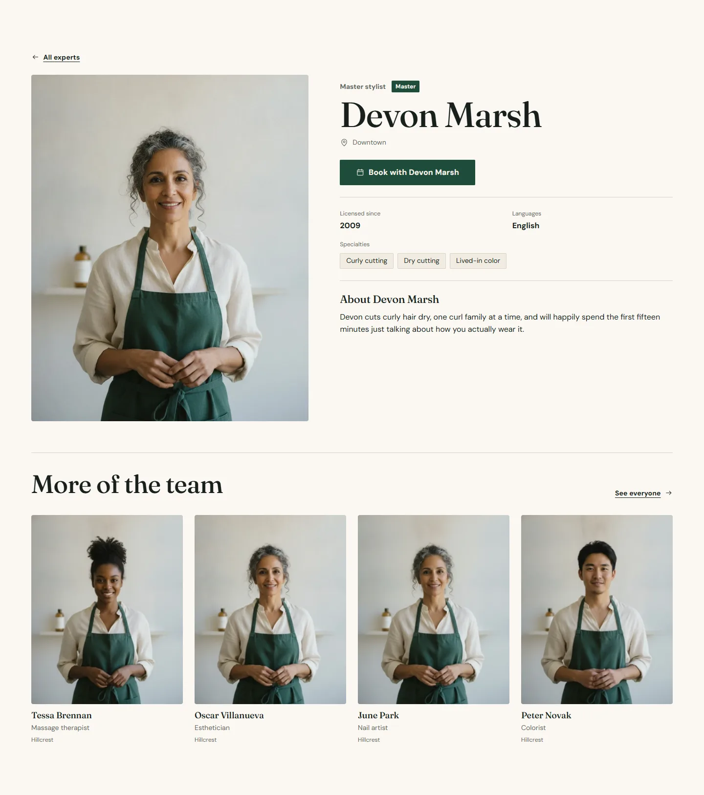
Expert profiles use the product template expert:
- Expert profile. Back link label All experts, Back link /pages/team. Leave the metafield keys at their defaults unless your definitions use other names. One More of the team block with Collection Team, Experts to show 4, Link label See everyone.
- Testimonials and a Call to action banner "Book by name, or let us match you".

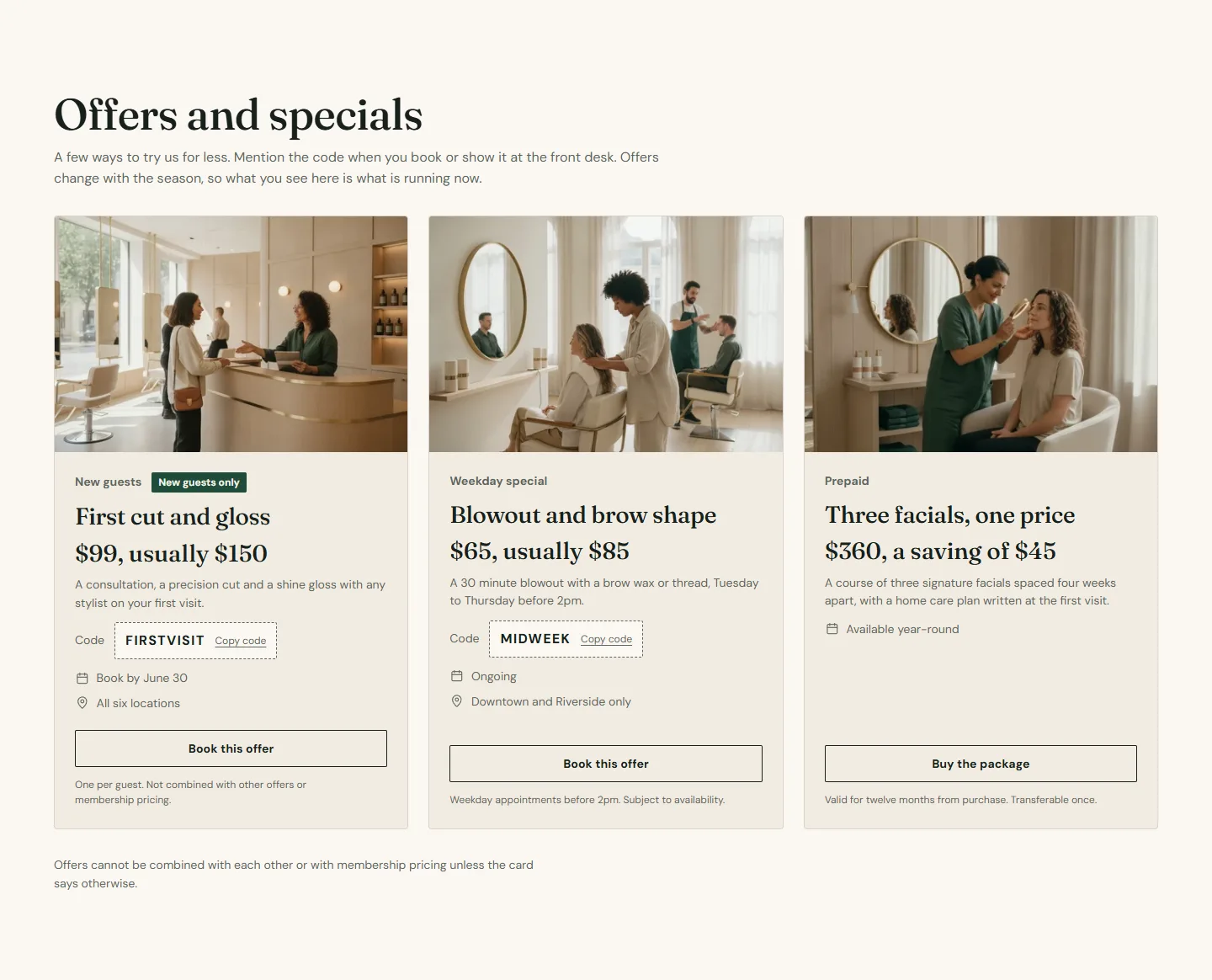
Offers page
Template: offers.
- Page content shows the page title and text.
- Offers grid. Heading Offers and specials, Layout Grid, Columns on desktop Three. Three Offer blocks, each with Image, Eyebrow, Heading, Text, Price line written out ("$99, usually $150"), an Offer code, Expiry written out, Eligible locations, Terms, Button label Book this offer, a Booking ID and Booking link type.
- Gift card band. Heading Give an afternoon off, Amounts 50, 100, 150, 250, Gift card product your gift card, Link to the booking provider's gift cards on, Layout Image left.
- Policies strip. Heading Good to know before you book, Layout Grid, Columns on desktop 4. Four Policy blocks (Cancellations, Deposits, Running late, Results vary), each with an Icon, Title and Text, and one Credential block with Label Licensed by and the license Value.
- FAQ "Offer questions" and a Call to action banner.
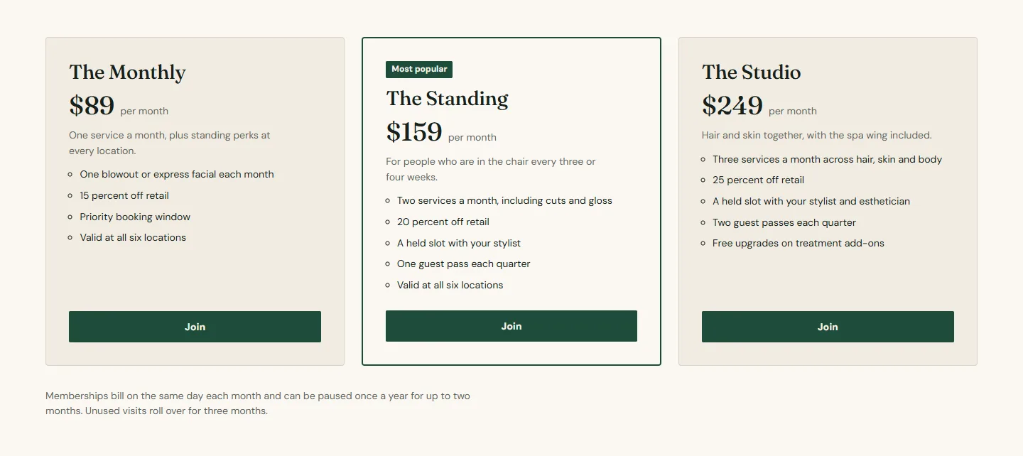
Memberships page
Template: memberships.
- Rich text intro.
- Plans, cards. Heading Memberships, Layout Cards, Featured label Most popular, Footnote on billing. Three Plan blocks with Name, Price as text, Billing cadence, Description, Perks as a bulleted list, Feature this plan on one, Button label Join, a Booking ID and Link type Membership.
- Plans, comparison. The same three plans with Layout Comparison table and Heading Compare the plans.
- Plans, packages. Heading Service packages, three Plan blocks with Link type Series package.
- FAQ "Membership questions".
Shop pages
These use the product, collection, collection list, cart and search templates. Products and collections are created in the Shopify admin; the demo has nineteen products including a gift card and eighteen automated collections by tag.
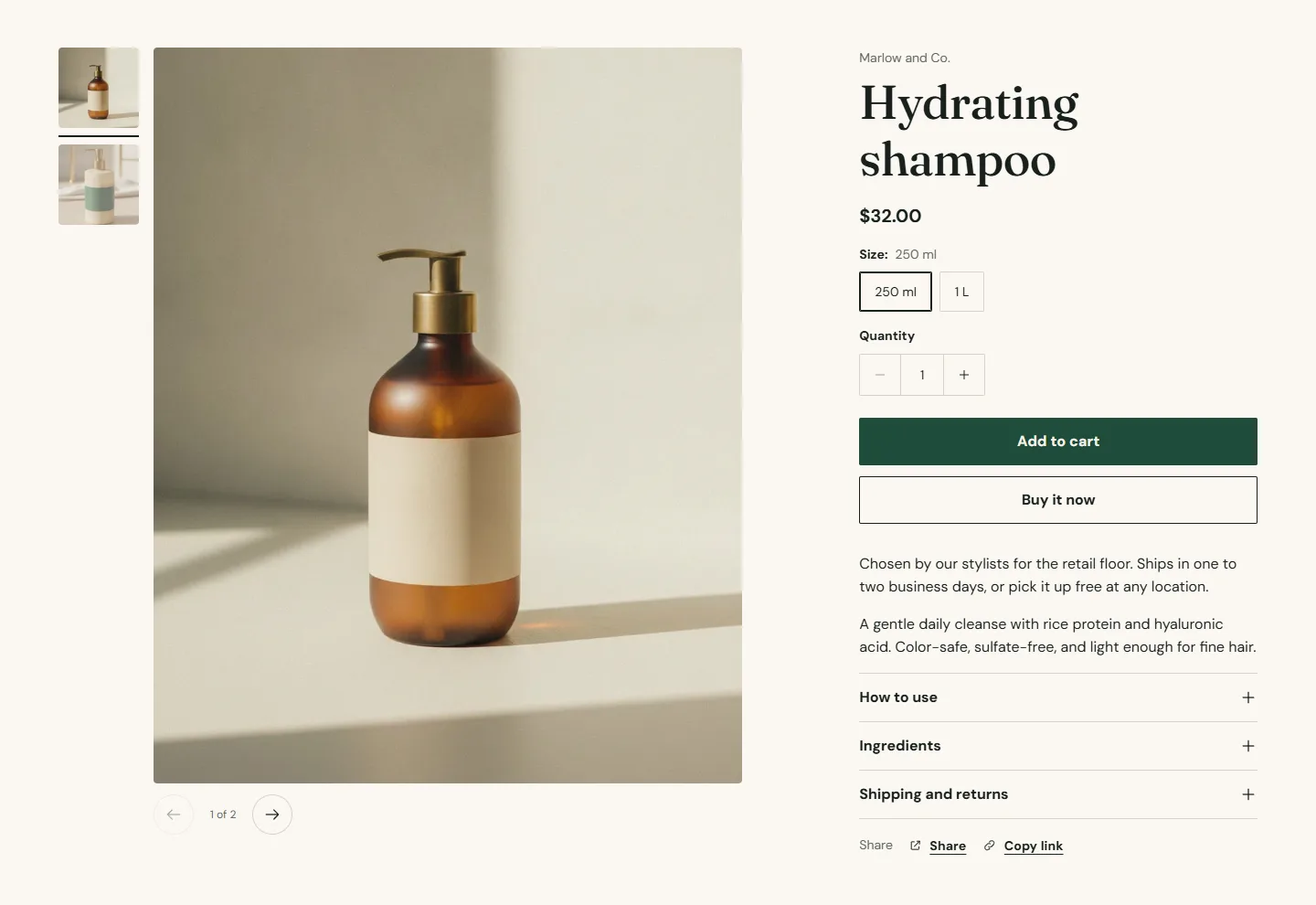
- Product information. Gallery layout Thumbnails on the left, Open images full screen on, Keep details in view while scrolling on. Blocks in order: Vendor, Title, Price with Show tax and shipping note on, Variant picker (Style Buttons, Swatch shape Circle), Quantity, Buy buttons with Show dynamic checkout buttons and Show Shop Pay Installments on, Pickup availability, Text, Description, three Collapsible rows (How to use, Ingredients, Shipping and returns), Share.
- Product recommendations twice: Recommendation type Complementary products with Heading Pairs well with and Products to show 3, then Related products with Heading You may also like and Products to show 4.
- Collection banner. Use the collection image on, Banner height Medium, Overlay 40.
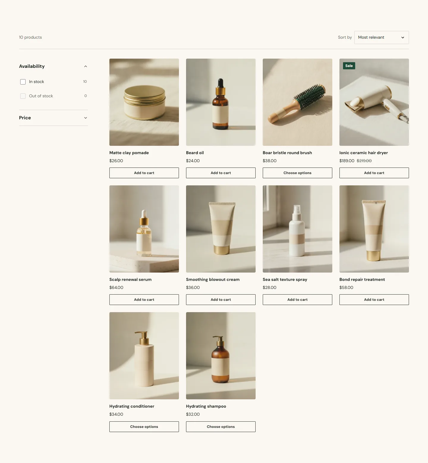
- Product grid. Enable filtering on, Filter layout on desktop Sidebar, Enable sorting on, Columns on desktop 4, Columns on mobile 2, Products per page 24, Show more products with Numbered pages.
- Cart. Show accelerated checkout buttons on, a Free shipping threshold that matches your shipping rate, Show Book now button on for the empty state. Theme settings → Cart sets Cart type Drawer and Show order note on.
- Search results. Results layout Grouped by type, Filter layout on desktop Drawer, Suggestions heading Start with a shelf, four Collection blocks shown before anyone searches.
Journal
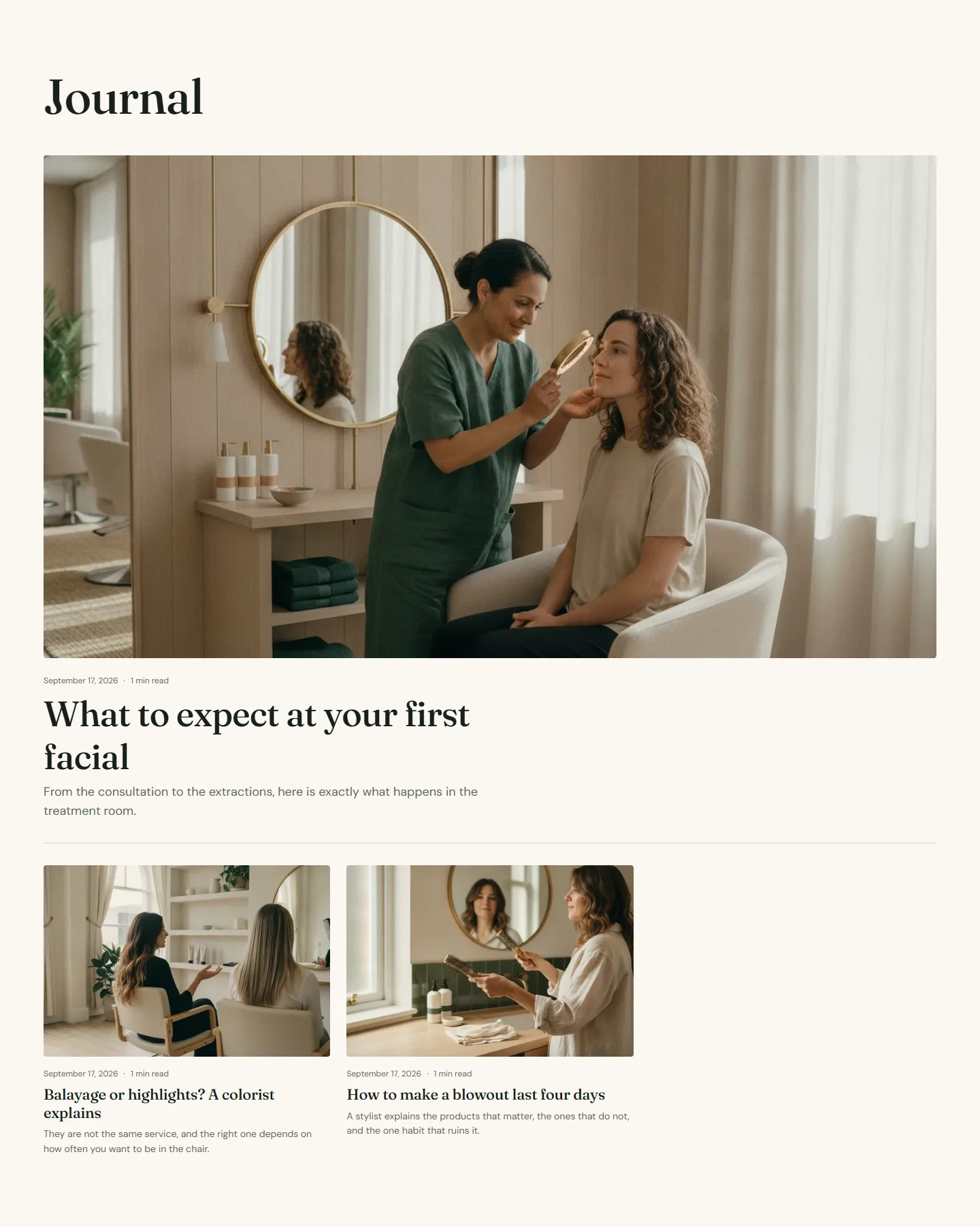
- Blog posts (main blog). Show topic filter on, Layout Grid, Columns on desktop 3, Feature the newest post on, Posts per page 10, Image ratio Landscape, Show reading time on.
- Blog post (article). Blocks: Featured image at Image width Wide, Title and meta with date, author and reading time, Post content, Share, Topics.
FAQ page
Template: faq.
- Rich text with the page introduction.
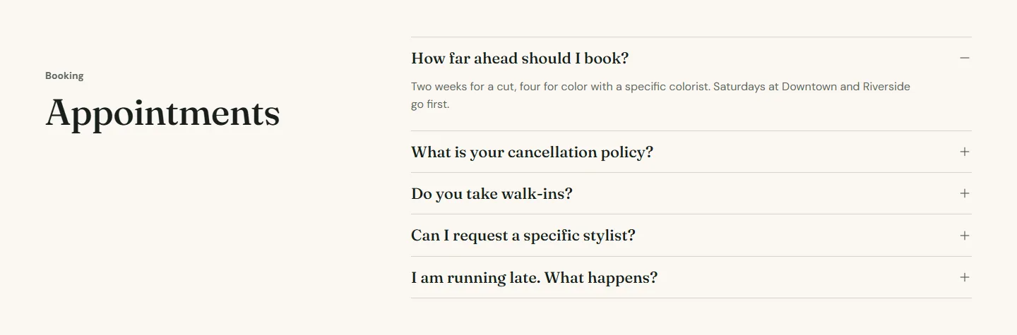
- Three FAQ sections, one per topic: Appointments, Hair, color and skin, In the salon. Each has Eyebrow (Booking, Services, Visiting), Heading, Layout Heading beside questions, Open one answer at a time on and Add FAQ structured data on. Open the first answer is on for the first section only, so the page opens with one answer showing.
Contact page
Template: contact.
- Page content with Show page title on.
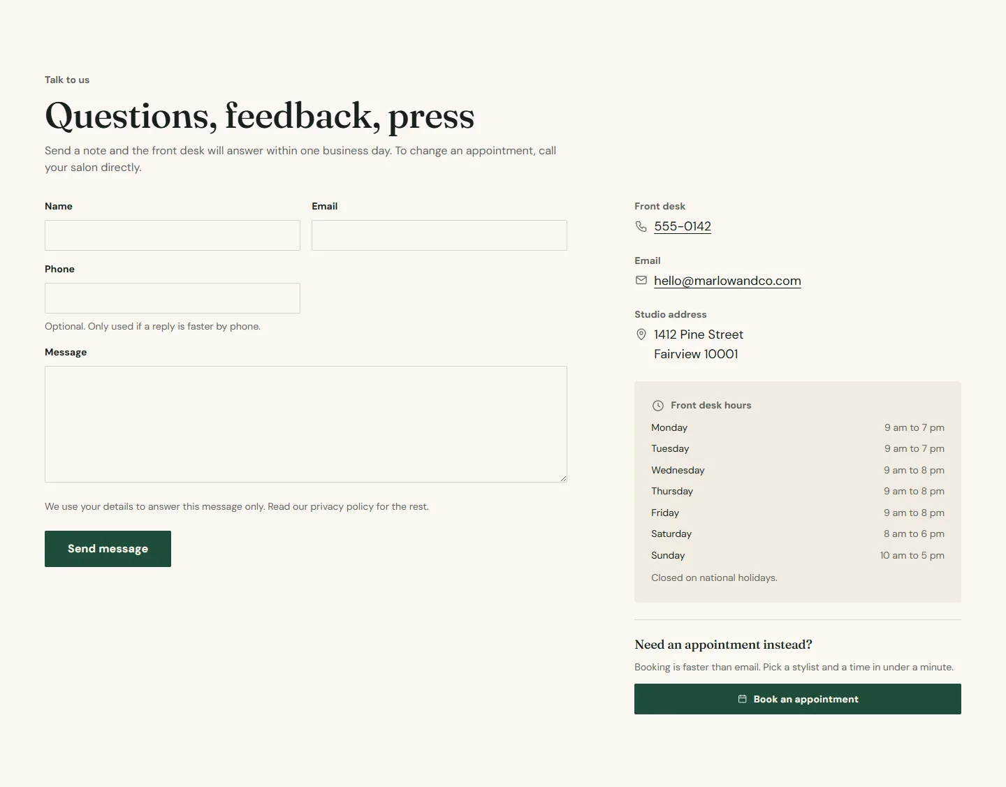
- Contact form. Eyebrow Talk to us, Heading Questions, feedback, press, Submit button label Send message. Three Contact detail blocks for the front desk phone, an email and the studio address, with Kind of detail set to Phone number, Email address and Street address so each becomes a link. One Opening hours block with a line per day, and one Booking button block. A Map block is available if you export a map image; the demo leaves it out.
Careers page
Template: careers.
- Hero with a single slide at Height Medium.
- Stats band. Color scheme scheme 2, three Stat blocks with Value, Label and Caption, Columns on desktop 3, Show divider lines on.
- Multicolumn. Eyebrow What the job comes with, Heading The part nobody posts about, Columns on desktop 4, Column style Plain with a rule, Layout on mobile Swipe sideways. Four Column blocks with an Icon each (Clock, Award, Shield, Scissors).
- Gallery. Heading A week on the floor, Columns on desktop 3. Five Image blocks with a Caption each; the first and the last use Tile size Feature.
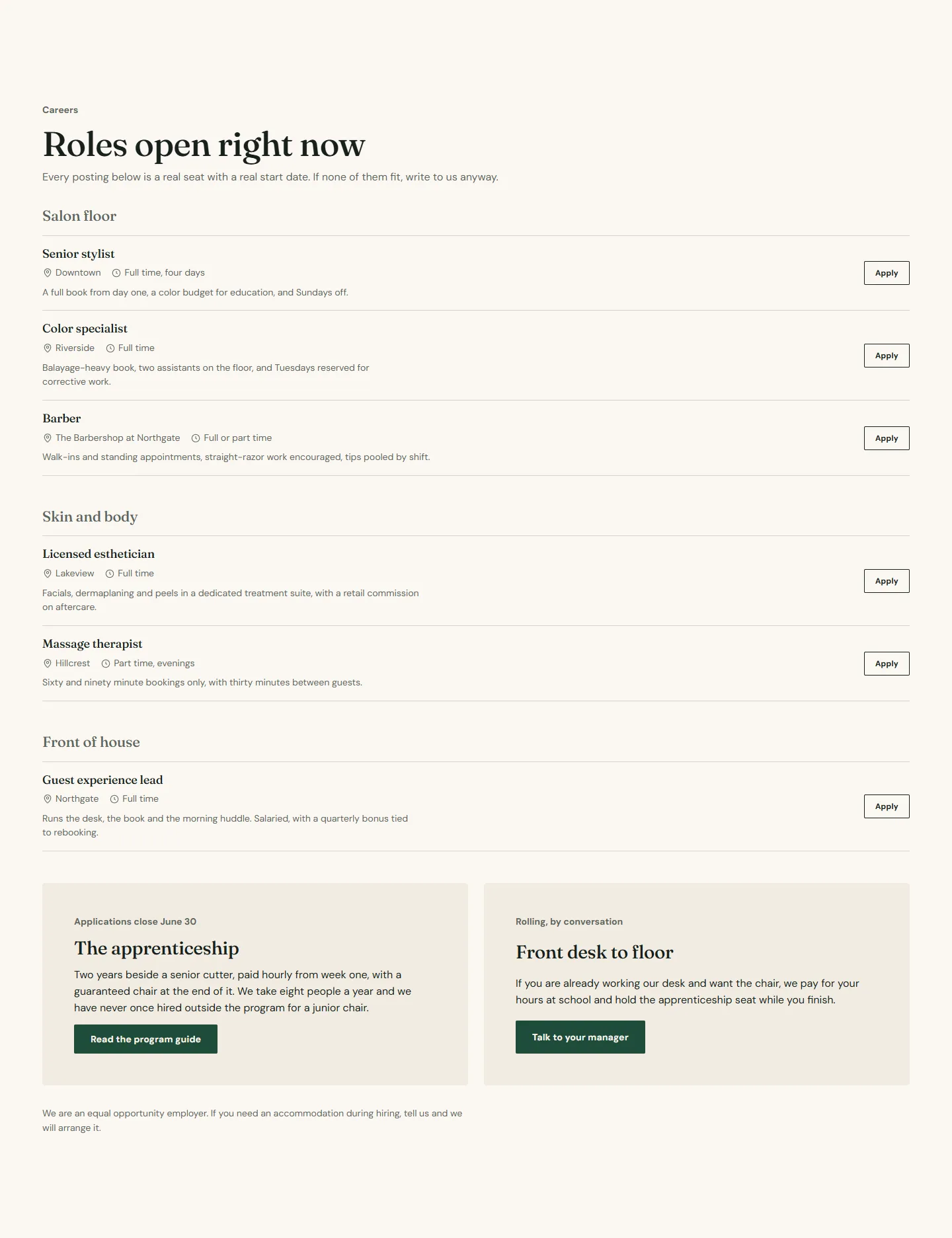
- Open roles. Heading Roles open right now. Six Role blocks grouped by Group (Salon floor, Skin and body, Front of house), each with Title, Location, Schedule, Summary and an Application link, followed by two Program blocks: the apprenticeship and a front desk to floor program, each with a Date line and a Button link.
- Testimonials from staff (Eyebrow From the floor, Layout One large quote at a time) and a Call to action banner "Send us your work anyway" with Use the booking button off and a Second button link to the contact page.
About page
Template: about.
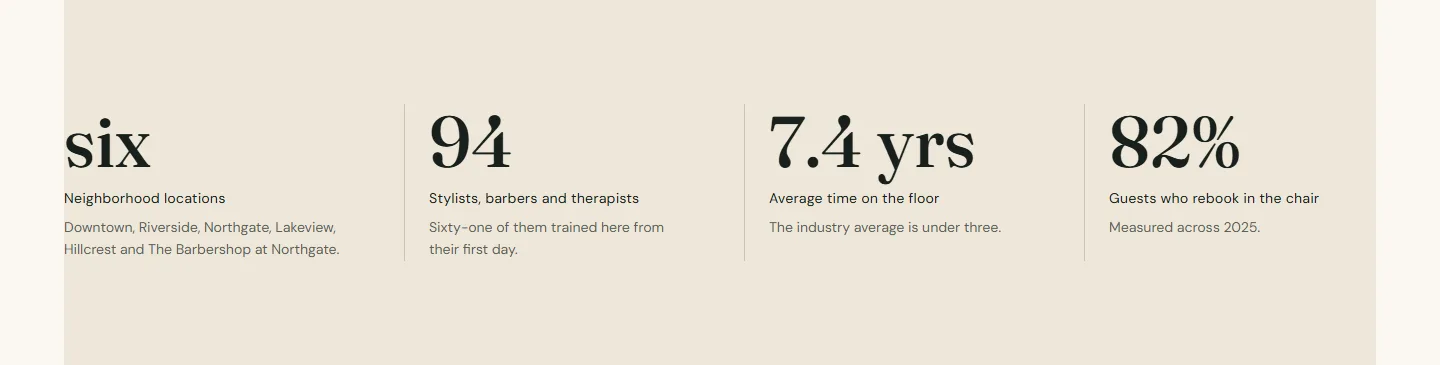
- Hero with an Eyebrow Since 1998, Image with text with Eyebrow, Heading, Text and Buttons blocks and a Second image overlapping the corner, Stats band on scheme 3 with four stats, Testimonials with Layout Grid and Columns on desktop 2, Logo marquee with Scroll the logos off, and a closing Call to action banner.
Footer group
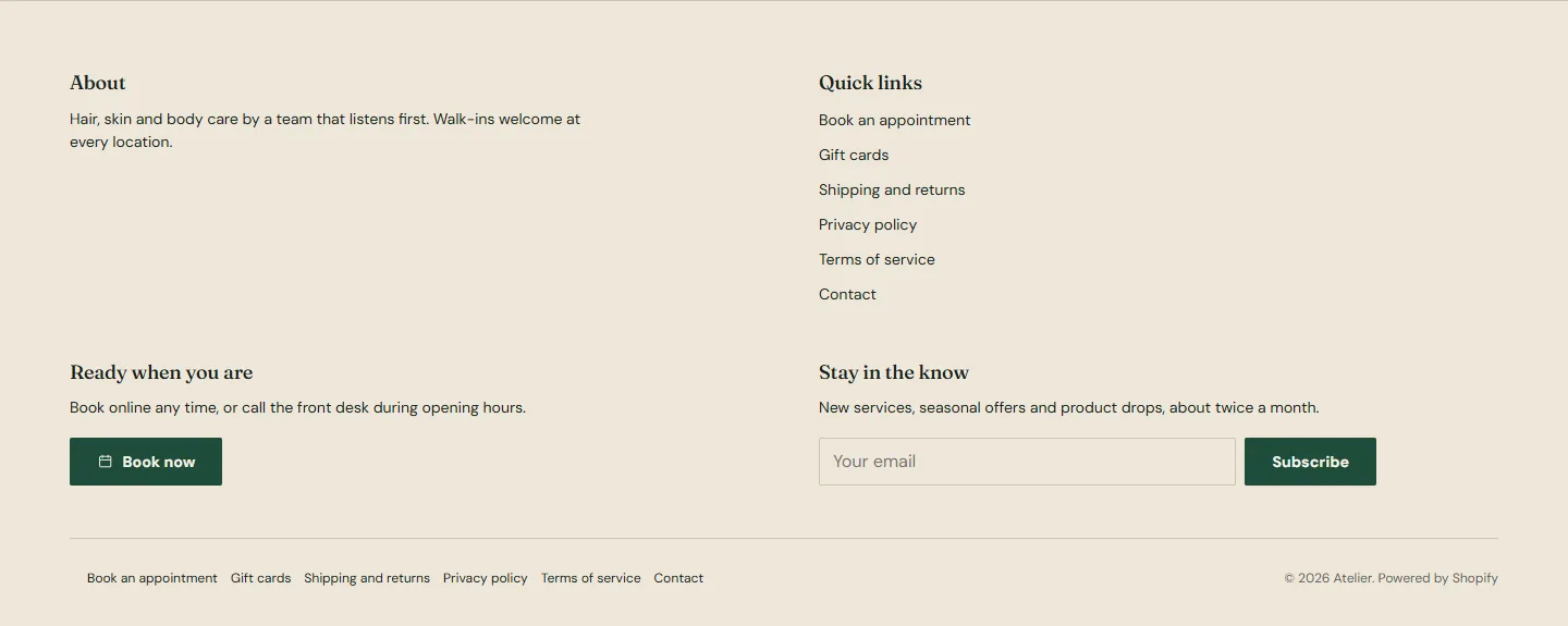
- Footer. Color scheme scheme 3, Bottom links menu Footer, Show payment icons, Show country/region selector and Show language selector on. Blocks in order: Text (About, with Show social media icons and Show Follow on Shop button on), Menu (Quick links), Booking (Ready when you are, with the front desk phone), Email signup (Stay in the know).
Publish
- Preview every page on a phone. Then choose Publish in the editor, or Actions → Publish on the Themes page. Your previous theme stays in the library so you can switch back.